Goodbye Winter…Hello Spring!

penquin2

Image

New Website

Check out my new site, it has a new look. marekszkudlarek.com

New Website

Final Portfolio Presentation

This slideshow requires JavaScript.

View Portfolio

Final Portfolio Presentation

Magazine Print Layout

ipad-magazine-mockup

We were to create, name and design a magazine that fits into an existing category: fashion, music, design, men’s style, architecture, food, etc.  I started by creating a fun creative logo for the magazine, then I experimented with different typography choices to find the most suitable typeface for my audience.  Stock images were sourced that offer an architectual feel to the magazine, which also helped to design each page layout.  The light use of colour played a role as well, using complimentary colours throughout the magazine.  Page elements, styles, pull quotes and folios were also used in Indesign to achieve the overall design of my architecture magazine.

magazine-mockup1magazine-mockup2magazine-mockup3magazine-mockup4


Magazine Print Layout

Box Package Design Band-Aid

package-design

One of the final big projects for the program was to create a box package design for any type of product.  Students were to design everything from the production artwork to the final mock-up prototype for this product.  Market research, identifying the target audience and conceptualizing played a major role in guiding the success of this project. Designing this product involved creating die-line mechanicals, specifying the custom cut-lines to accommodate glue flaps, folding tabs, etc.  The final production artwork includes the necessary die-lines, bleed, measurements and spot colour requirements.

I am very happy how this project turned out, it was probably one of my favorite assignments to work on. Have a look at my design process.

Product Ideas, Sketches and Market Research.

This slideshow requires JavaScript.

Die-Line Mechanicals, Bleed, Measurements and Final Artwork.

This slideshow requires JavaScript.

Final 3D Package Rending

This slideshow requires JavaScript.

Final Result: The physical prototype

bandaid-real

Box Package Design Band-Aid

Techinal Drawing #2

techincaldrawing_marek_handin2

For my technical drawing I chose the very well-known, Toronto Streetcar. I really appreciate the toy-like quality the older streetcar has. I was outside and noticed them passing by, one after another and thought it would be a great subject for this project. I found a high res image online which served as the foundation for my drawing.
I began the outline process by tracing each element of the streetcar using tools such as the pen tool, the direct select tool, shapes and shape-builder tool, paths and patterns. The process took a little longer than expected but turned into a great learning opportunity. I improved my speed and became a lot more comfortable using the various tools which helped my confidence when it came to coloring and really, using Illustrator in general.

The traced image of the streetcar looked great but I was excited to see what it would look like after coloring. Some of the challenges and successes came from understanding gradient and gradient mesh tool, effects, outline mode, styles, drop shadows, layers and path finder. Organizing layers was not a strong focus during the outline process which made parts of the coloring process more difficult. In the future I am going to prioritize this as I can appreciate how much time I’ll save being more organized. In the end, I found the wheel system the most difficult part to recreate.

I think the overall image is convincing and represents the classic Toronto Streetcar well. Small details such as the streetcars route, the small stickers, the lights, the chrome detailing and the advertisement on the side (from my previous design project) help to bring it to life. This project has been a tremendously positive experience and I look forward to improving my Illustrator skills further.

Have a look at my process…

The original high resolution image sourced from the web.

techincaldrawing_marek_handin2

First step, create outline using various tools. ie; shape builder, pen tool etc.

techincaldrawing_marek_handin2

Step two, color! Using tools such as live paint, gradient, gradient mesh, effects, transparencies, shadows and textures.

techincaldrawing_marek_handin2

The final ad.

techincaldrawing_marek_handin


Techinal Drawing #2

COMPOSITE #2: CD RELEASE & WEBSITE

web_mockup

PROJECT SUMMARY

The band I chose for my CD project is Snowday, a chill-out electronic duo from Toronto, Canada.  Cam Sloan and Chad Skinner went back to the basics, jamming with small acoustic instruments they collected throughout their travels in Europe.  Their newfound appreciation for acoustic textures coloured the material they recorded upon their return home. This sound became Snowday’s first songs.  Fans are both male and female, in the early 20’s to late 30’s age group.  It is not uncommon to hear their music in a lounge setting while enjoying an exceptional beverage in a swank hotel bar.

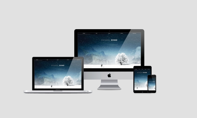
The two friends met in high school and have made music together in various projects and bonded over a mutual love of underground hip-hop from their home town of Ottawa.  Later inspired by the records they were sampling and with a desire to become better performers, they taught themselves to play their own instruments.  Everything from piano, guitar and more wordly, less common instruments paved the foundation for Snowday’s live organic approach to ambient pop.Cam and Chad are only just beginning to develop their branding identity, so it was a great opportunity to produce the album artwork and overall style of the printed media.  I decided on a ‘single-page’ scroll layout for the website, with a fixed navigation menu at the top, which linked to each section of the page: Home, Bio, Tour, Media, and Contact – with links to social media including Twitter, Facebook, Instagram, YouTube and Sound Cloud. The images were sourced from the bands online site, however, stock images were used for the header and the CD package design. All written text was sourced from the band, although details such as tour dates were fabricated in order to reflect the unconfirmed future performances.

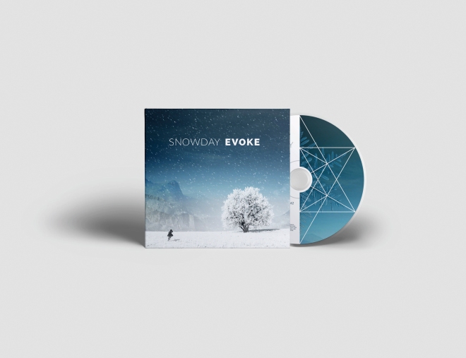
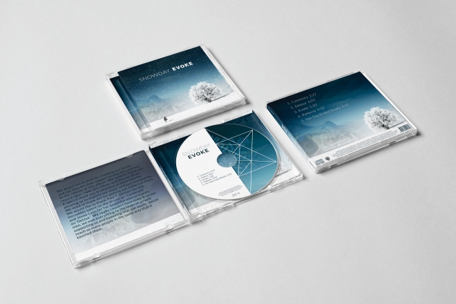
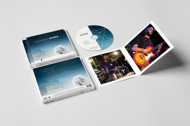
Their upcoming debut album, Evoke is a chill-out, feel good, sensual as it is psychedelic.  Swirling synths and laid back guitars swim in washes of liquid reverb and sparkling delays, all gently propelled by an understated and pulsing rhythm.  The majority of the album is instrumental and meditative, broken up by ethereal violin sounds by Jessie Lyon and heart-racing drum performance by Paul T. Geldart.The design of both CD and website incorporates many functional elements such as live media links to audio/video and an image gallery.  The colour palette and the consistency
of it’s use played a big role in tying all the pieces together.  The website keeps fans up-to-date on upcoming shows and performances in the Tour section.  Fans are able to explore the band and their music on a more personal and intuitive level, allowing them to take away an appreciation for the style rather than be told how to enjoy the experience.

Have a look at my final CD mock ups.

cd_mockup_Page_1cd_mockup_Page_2cd_mockup_Page_3

COMPOSITE #2: CD RELEASE & WEBSITE

FRANK MENU RE-DESIGN

I began by looking at the The AGO ‘s website to get a better understanding of their style.  I reviewed a history of Frank Gehry’s work so I could familiarize myself with his unique (and surprisingly playful) creativity.  I designed two mood boards with two individual themes.  From there, I looked at various type options and colour palettes that were consistent with the style of both the venue and the artist who’s name the restaurant was named after.

The colours were inspired by the museums incredible use of wood, the font was chosen to be simple and minimally distracting.  I wanted the menu to be a reflection of both The AGO and Frank Gehry.  Some of the challenges I found with this project came when trying to decide how to incorporate the artists unconventional style into a menu filled with text.  In the end, I think thoughtful placement and simplicity allow the two elements to work well together.  The cover was meant to pay tribute to Frank, so I wanted his name to be the forefront.  Everything else was just a compliment.  I really enjoy the cubic “F” design I created in Illustrator, which plays homage to both the visual and the architectural components of the museum.


Check out my menu re-design for Frank at the AGO.

Marek_FRANK_Final_Page_1Marek_FRANK_Final_Page_2Marek_FRANK_Final_Page_3Marek_FRANK_Final_Page_4

FRANK MENU RE-DESIGN

Corporate ID Project

Marek_Advanti_CorporateID_proof-1

Our Corporate ID project has finally come to an end. Printed, mounted and handed in along with a very cool folder to go with it. We were assigned an imaginary company based on a real world company for inspiration. We were asked to create a corporate stationary for that company which included a new logo, a front and back business card, letter head and envelope. We were to sketch out designs and afterwards create three vector logos and choose a final design to create our stationary with.

My company was called Advanti Bicycles. Originally from Montreal, Quebec, they are a high end bike company that specialize in racing bicycles for triathlons. They have won design awards and their bicycles have been raced by top athletes in the Tour de France. Their product has an innovative frame design for rigidity, comfort and is exceptionally lightweight. The bicycles feature better front end stiffness, more precise handling, an uncompromising racing frame and a position perfectly adopted to the individual’s physique and riding preferences.

The target market for Advanti Bicycles are mainly healthy men between the ages of 24-35, with a starting income of $40,000. Located worldwide, concentrated in North America and Europe.

I had some logo ideas in mind but I wasn’t exactly sure what I wanted to create. I sketched a few shapes, shapes lead to lines, lines lead to gears and then some squiggly lines and then even a pineapple! Who wouldn’t want a gold metal plated pineapple on the head of their bike?! I would. However, that didn’t end up being the logo in the end. After hours of playing in illustrator and using the Adobe Capture app on iOS to create custom vector shapes from a photos I have taken, I ended up creating multiple logo designs and type choices for my brand.

Have a look at the process I took to create this brand identity for Advanti Bicycles.

This slideshow requires JavaScript.

stationery_branding_mockup


Corporate ID Project